
How to Use Burndown Charts
Keeping Your Projects on Track

© GettyImages
GMVozd
Burndown Charts provide an at-a-glance view of a project's progress.
Melissa is sitting in her new Manhattan office, with spectacular views over the Hudson River, but she can't enjoy it on this evening as she stares anxiously at her computer screen.
She runs a fast-growing tech startup, and is aware that renting offices in the heart of New York is a stretch for her budget. But the company is doing well. In fact, it has just landed a major new software contract. It's a deal that could establish her company in the market.
Melissa is worried that the time frame for delivery is incredibly ambitious, and she's not sure if her team can meet the deadline.
Part of the answer to Melissa's headache could be to use a Burndown Chart. It is a clear and simple graph that maps the work that's left to do on a project against the time that you have to do it in.
In this article, we'll explain how to create and use Burndown Charts, the pros and cons of using them, and how they fit within Agile Project Management.
Note:
You can get a deeper understanding of Agile Project Management with our articles on the subject. Discover how to use Scrum meetings, story points, Kanban Boards, and User Stories. You can also explore tools and resources that cover more traditional aspects of project management.
Understanding Burndown Charts
To understand Burndown Charts, you first need to understand some of the principles behind Agile Project Management. As its name suggests, Agile is a way of managing projects in a flexible, focused and responsive way.
While there are still clearly defined goals, Agile teams are more self-directed and less tightly led by their project leader than traditional development teams are. Project requirements are often developed just before work starts on a piece of functionality, there is a focus on user testing and customer feedback, and there is an emphasis on constant assessment and reassessment of the scope and direction of a product or project.
Development teams normally work in short bursts or "Sprints," typically two to four weeks long, to deliver tangible progress on their part of the project, often developing working releases of a product or a piece of software. They may use "User Stories" to plan work, and to see what is required and how to achieve it from the end user's perspective.
Teams will also use Scrum meetings and Kanban Boards. Scrums are quick, stand-up meetings, normally held daily, that allow teams to collaborate, listen and discuss progress, achievements, obstacles and support. Kanban Boards are a way of visually showing the status of projects due to be delivered during the Sprint.
Burndown Charts are a visual tool that you can use alongside your Scrum meetings or Kanban Boards. They were invented by software developer Ken Schwaber in 2000, to give teams a simple way of plotting hours-of-work or story points remaining on a project against the time available.
They show the "burndown" for each individual Sprint (which helps team members to see the progress that's been made during it) or for the project as a whole, which allows the team to see at a glance whether it's behind or ahead of schedule.
They can also be used to show "burn-up" (where progress is slower than expected) or days that have been "burned" (again where progress has not been as you might have wished). They can also be adjusted to show when a project or task has expanded or been extended.
Creating and Using a Burndown Chart
How you measure progress on your Burndown Chart is, naturally, going to depend on what your project is and the type of team you manage.
Let's look at how it might work by returning to Melissa in her Manhattan office...
Melissa wants to track progress daily to ensure that her project's very demanding deadlines are met. To do this, she takes charge of an Agile team, which has daily Scrum meetings to discuss what needs to be achieved in the current Sprint.
These tasks can be expressed as story points, which indicate the time and effort required to complete tasks. The team uses a Kanban Board to manage the project's flow, and updates it after each Scrum meeting to show the number of story points delivered that day. (A story point is only delivered when the project or user story that it belongs to has passed quality assurance successfully.)
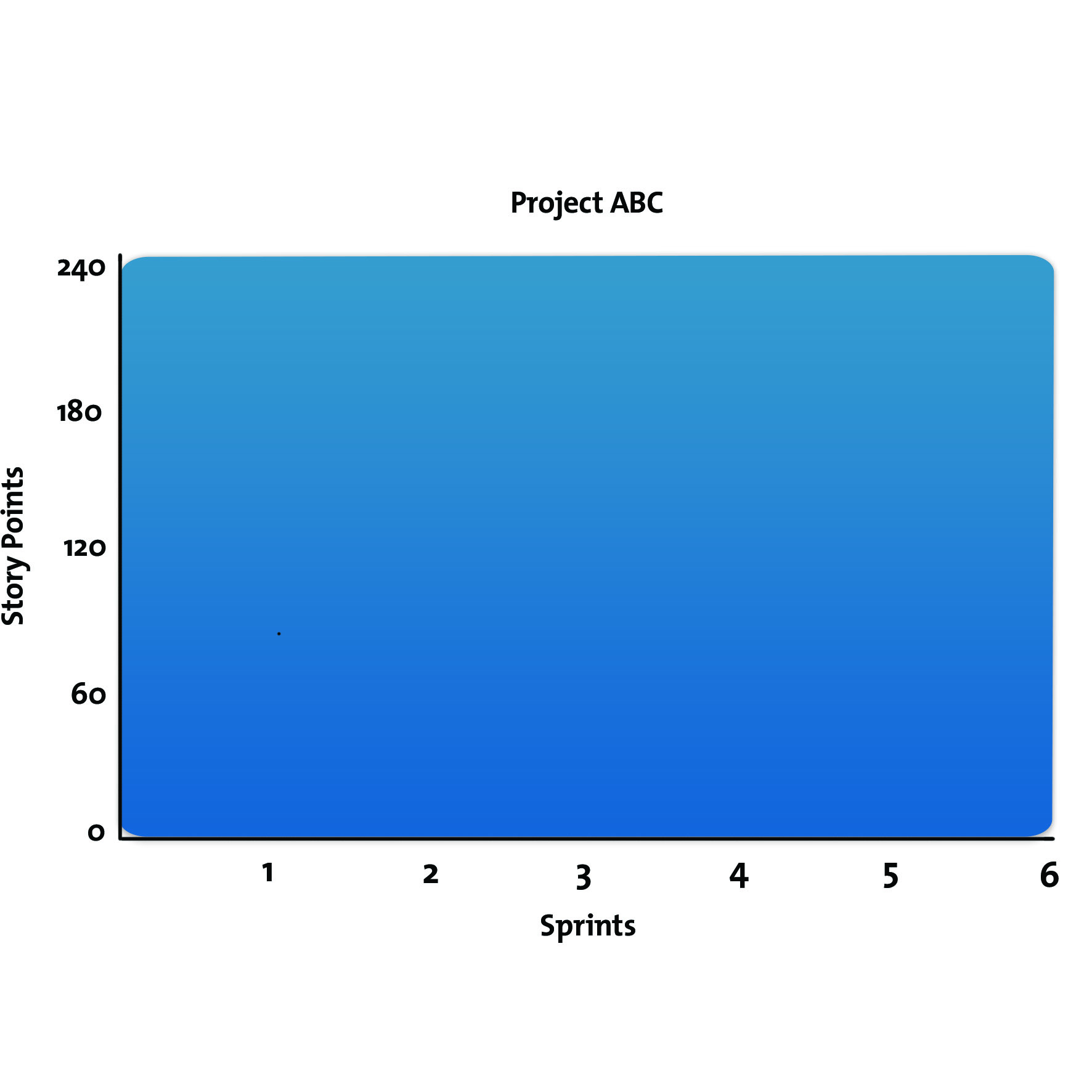
To create her "Project ABC" Burndown Chart, Melissa shows the number of story points on the vertical axis of her chart, and the number of Sprints along the horizontal. See figure 1, below.
Note 1:
You don't have to use story points and Sprints as your measure. For example, you could swap story points for a number of tasks on the vertical axis, and, on the horizontal axis, you could swap Sprints for the number of days you have to complete those tasks.
However, you would have to define clearly what you mean by "tasks" to measure what has been completed accurately.
Note 2:
Burndown Charts are also commonly used to track the progress of individual Sprints, with the work to be done plotted on the vertical axis, and the number of days of the Sprint marked along the horizontal axis.
Figure 1:
On this chart, Melissa can plot progress from her starting point of 240 story points. Her aim is to complete the project within six Sprints, or an average of 40 points per Sprint. If she succeeds in doing this, the chart will simply show a diagonal straight line down from 240 to 6, as in figure 2, below.
Figure 2:

In reality, of course, projects rarely run as smoothly as this, and this is where a Burndown Chart can come into its own. Figure 3, below, shows the actual Sprint progress of Melissa's Agile team.
Figure 3:
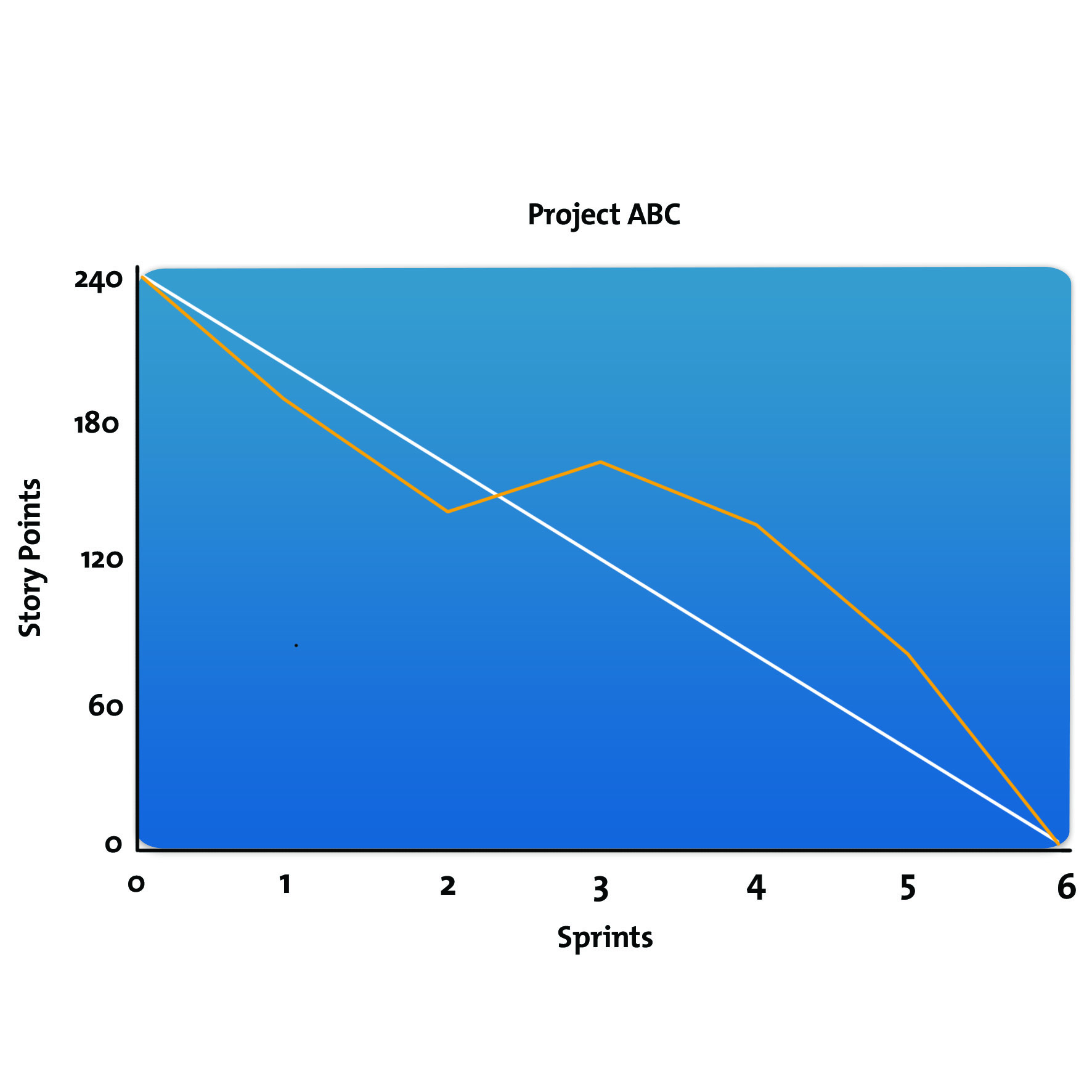
The chart shows that, while things went well during the first two Sprints, the number of story points to complete actually increased between Sprints two and three, before momentum was regained from Sprint three onwards.
There could have been a number of reasons for this: a key team member being off sick during that Sprint, the Sprint proving to be more difficult or complex than anticipated, or perhaps the client changing the scope of the project. The important thing is that Melissa and her team will have been able to see that progress was being delayed, and take appropriate action.
Pros and Cons of Burndown Charts
The main benefit of Burndown Charts is their simplicity: they are an easy-to-follow visual representation of what your Agile team has achieved, what it has yet to achieve, and whether it is on target to meet its deadlines.
They can alert you quickly to any potential problems or bottlenecks. If a chart shows a plateau, it gives a clear indication of where people need to put in extra work to bring a project back on track.

Subscribe to Our Newsletter
Receive new career skills every week, plus get our latest offers and a free downloadable Personal Development Plan workbook.
Read our Privacy PolicyBurndown Charts can also be a useful motivational tool. They show your team what's still to do, but also how much it's successfully completed.
But they do have some weaknesses. For example, they only show what work has been completed, not what task or story point is in progress and how close that work is to completion. You should be covering this element in your regular Scrum meetings, but this highlights that a Burndown Chart only provides part of the picture.
Burndown Charts can lead to over-heightened expectations. If you're expecting your Burndown Chart to run in a neat, straight line – and are aggressively managing your team's performance accordingly – there may be a risk of team members becoming disgruntled or demotivated, especially if they feel that the chart has become a "stick" to be beaten with, or that they are constantly under the performance microscope.
Often, there can be a plateau midway through a project, when a lot of the most complex elements are being completed, and then an acceleration to the finish at the end. You need to recognize that, and factor it into how you manage your team and your project. Again, you can address these issues during Scrum meetings.
It is important not to become overly reliant on your Burndown Chart, and to use the whole range of your project management skills.
Key Points
Burndown Charts offer a simple, visual representation of where you and your team are on a project, and whether you are on track to deliver it.
They are commonly used within Agile Project Management, and they measure the progress of a project by plotting the tasks that need to be completed against the time available to deliver them.
They can be a powerful tool for showing work completed, but they are less effective at giving a clear picture of work that's in progress or only nearing completion.
This site teaches you the skills you need for a happy and successful career; and this is just one of many tools and resources that you'll find here at Mind Tools. Subscribe to our free newsletter, or join the Mind Tools Club and really supercharge your career!


Burndown charts are simple and effective, but only once you've mastered the use of "story points". It's worth going to the trouble of learning how to use story points.
In my opinion, these more modern ways of doing project management are more user friendly and the actual pm admin doesn't take up as much time as some of the older models.